ULink's new look and features announced
The Office of Communications and Marketing conducted research last year to see how students and employees use ULink and to identify opportunities for improvement. Data collected from surveys, focus groups, and user testing led to ULink's redesign and reorganization.
The overall feedback was that there were a lot of links in ULink that all appeared to have the same level of importance. None stood out, and users said it wasn’t easy to find things quickly. When asked what they wanted, the overall feedback was less scrolling, a cleaner and simpler design, better organization of links, more color, and improved navigation.
ULink’s new look and organization was created with these recommendations in mind.
New Look
The redesign features a new accent color – teal. The University is currently redesigning its websites, which will also feature teal.
The large image of Stephens Hall and the arches was removed to better utilize the vertical space on the page. The goal was a cleaner, simpler, and more organized look.
Quick links
One of the most significant new features is the “quick links” section.
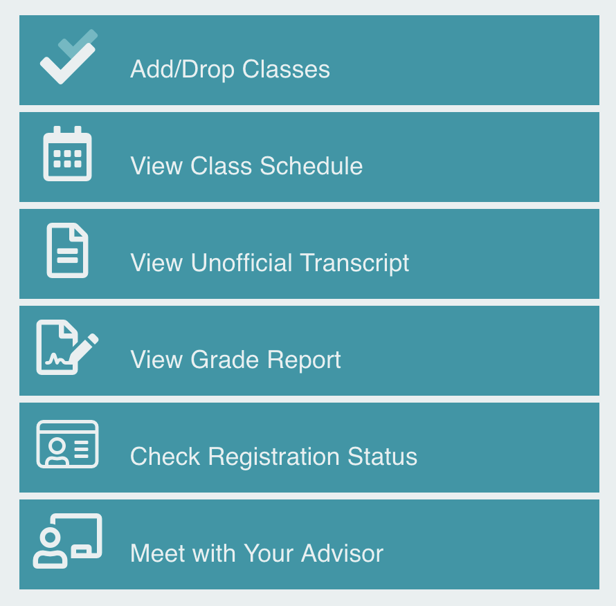
Sections of “quick links” are featured on the tabs/pages in ULink that have a lot of links. “Quick links” are the most used links that appear on a particular page. This new feature can help users quickly find the links they visit the most often.
New Landing Pages for Users
Users would previously land on the Home tab when logging into ULink. The focus group feedback indicated most users immediately clicked off the Home tab to another tab upon logging in. Most had not scrolled down the Home tab to see what was on it. Most users go to ULink to complete a task, and landing on the Home tab was creating an additional step and required another click.
To improve user experience, students now will land on the Academics tab when logging into ULink and employees will see the Employee page. The Home tab has been replaced with a News & Events tab.
Organization
Part of the research included reviewing the Google Analytics data for ULink to review link usage. Generally, ULink has been organized according to the links that get used the most to improve ease of navigation for the user.
Show/Hide Links
Some respondents wanted to be able to customize ULink based on their needs, e.g., show or hide sections of links, move things around, etc. Unfortunately, ULink currently does not allow this.
With those suggestions in mind and in an effort to better organize ULink and reduce scrolling, a “show/hide” feature was implemented.
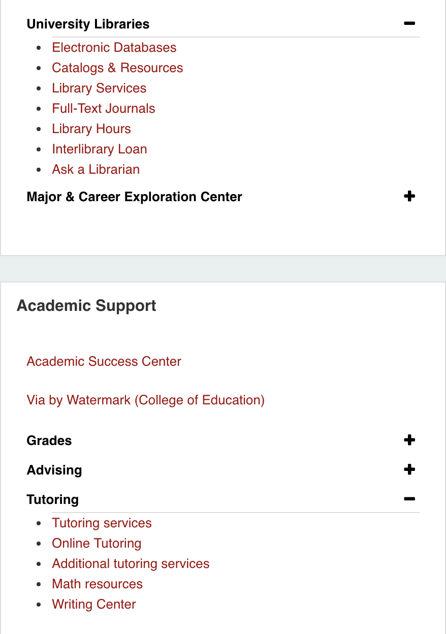
Some sections of links are grouped together underneath a heading, i.e., hidden. The heading of the grouping is in black font and there is a “+” to the right of the text. Simply click on the heading to reveal the links in that group.
If you click on a second header within the same box, the previously opened header will close. Regardless of the headings you click and expand during a session, all headings will default to closed when users log in again.
Time Entry
Time Entry remains on the Time Entry tab in ULink, but links for unclassified and classified employee time entry will now also appear on the Employee, Student Employee, and Grad Assistant tabs.
Questions
If you experience any technical issues when using ULink, submit a ticket to the IT Service Desk. If you have any questions, comments, or concerns related to the redesign or restructuring of ULink, email communications@louisiana.edu.